check
Branding
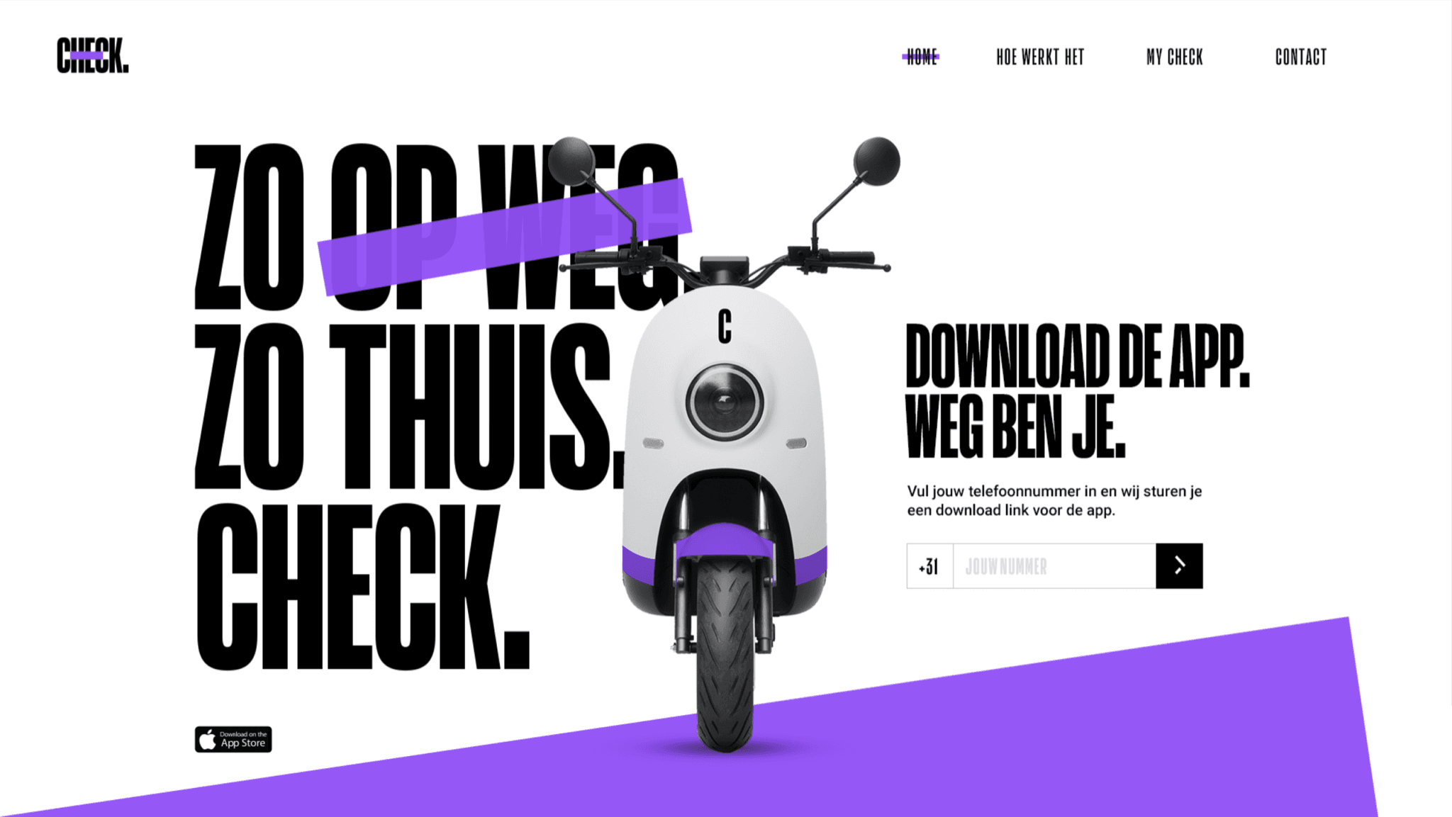
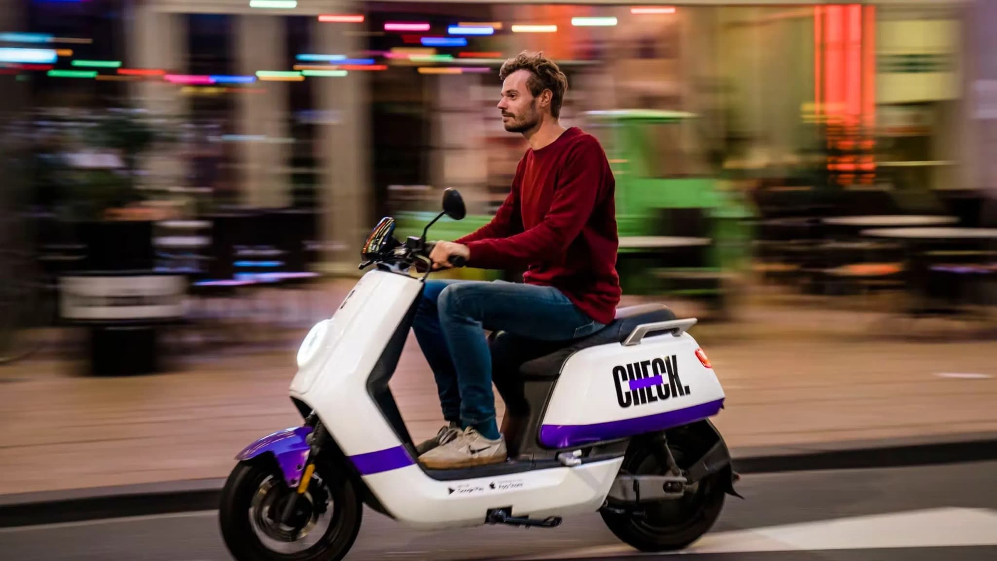
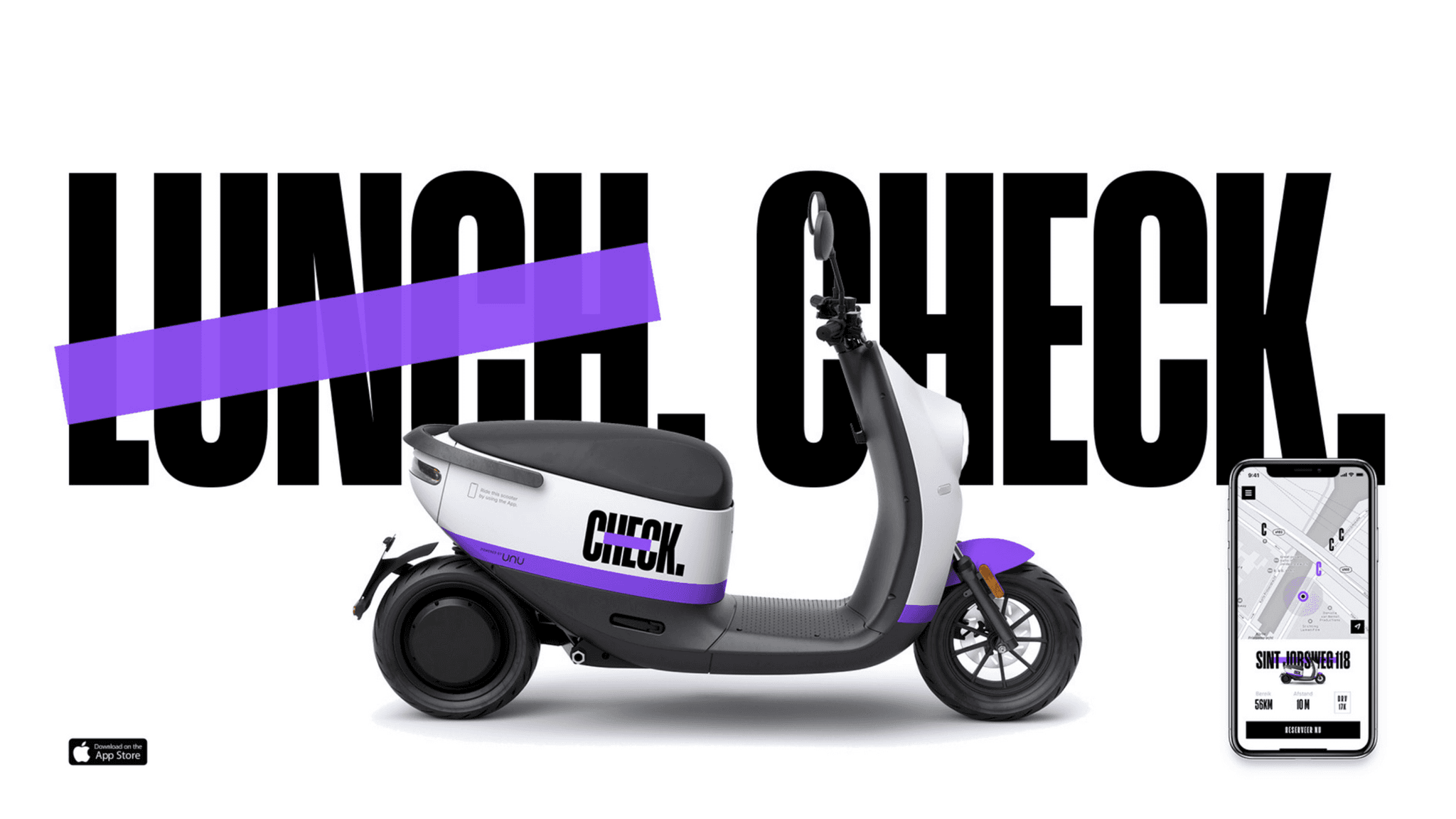
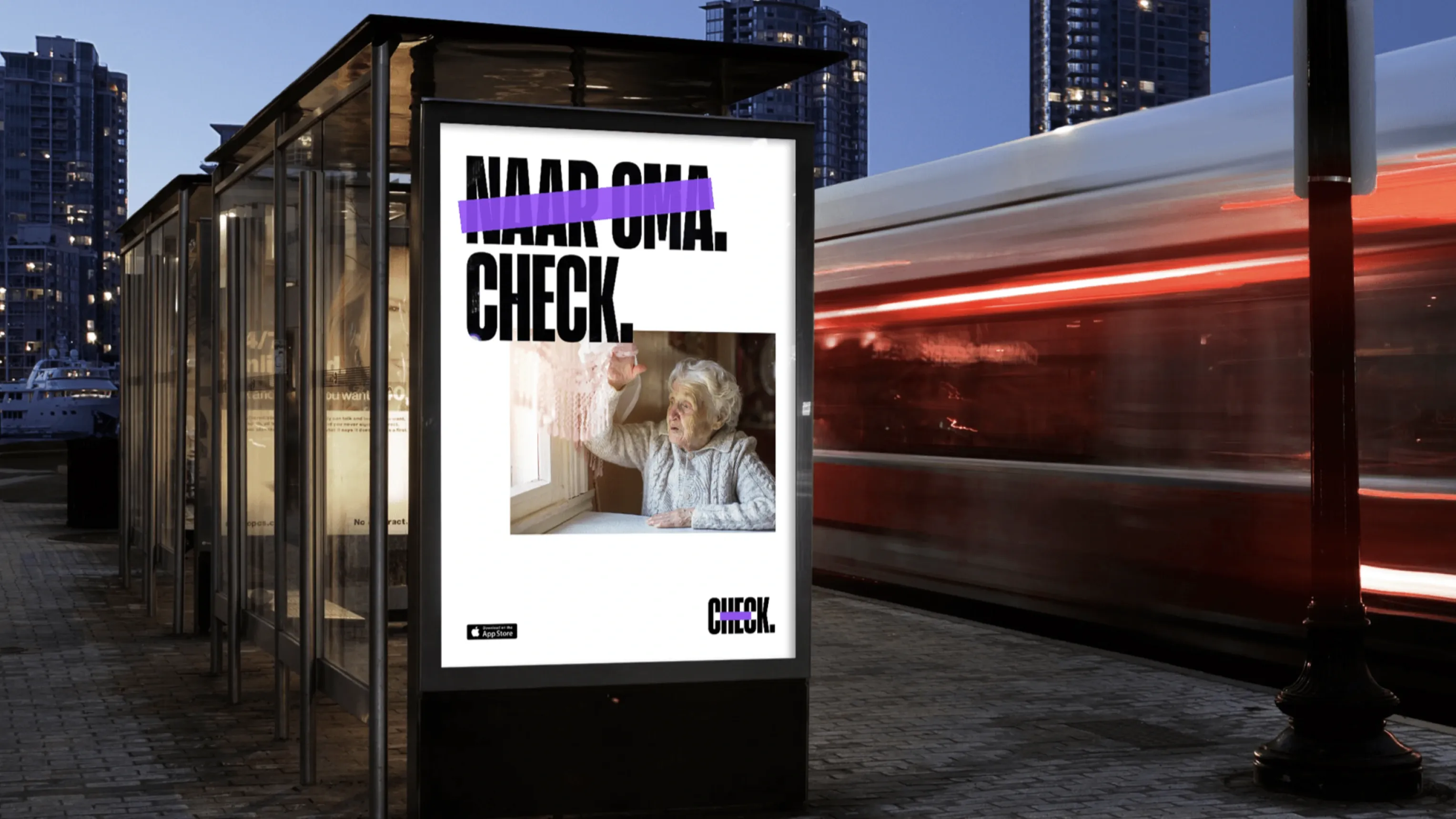
Check's e-scooters are the solution for a lack of space in the city. Check is smart mobility for a generation that wants everything within reach at once. Visiting your grandmother? Check. Just before closing time to that one store? Check. All over town with your friends? Check.
CHALLENGE
Introduce a new electric scooter sharing service that aligns with the needs of present day urbanites.
APPROACH
our approach combined simplicity and punch.
We needed to differentiate in a commodity market, but only had a specific set of touchpoints at hand. Therefore our approach combined simplicity and punch. Check is smart mobility for those who want everything at their disposal, instantly. Coffee at your gran? Check. Last minute shopping spree? Check. Roam across town with all your friends? Check.
SOLUTION
Outgrowing the competition? Check.
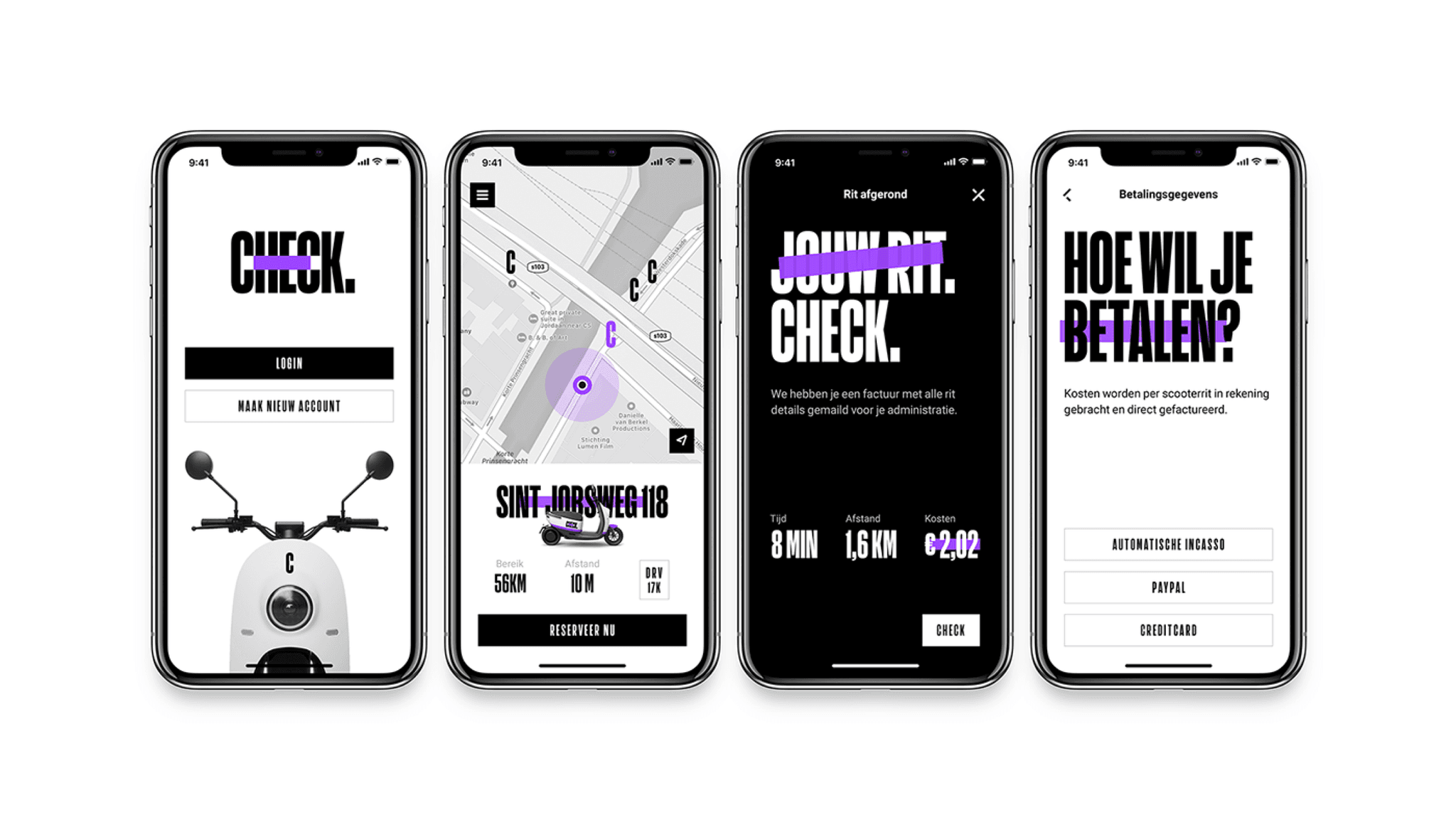
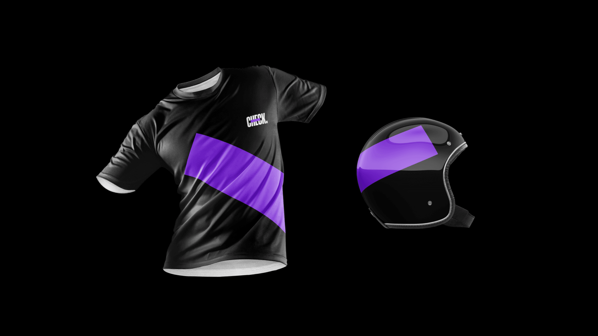
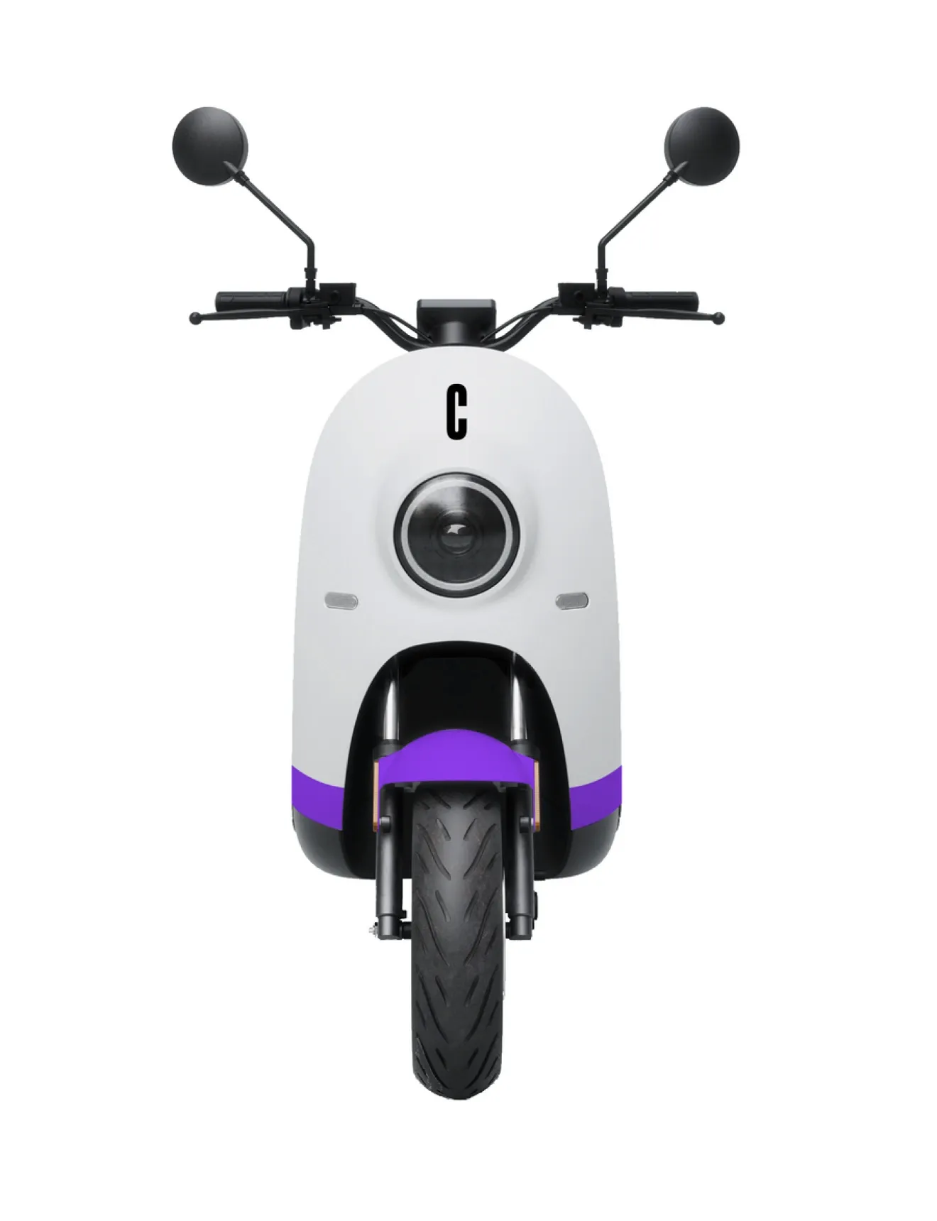
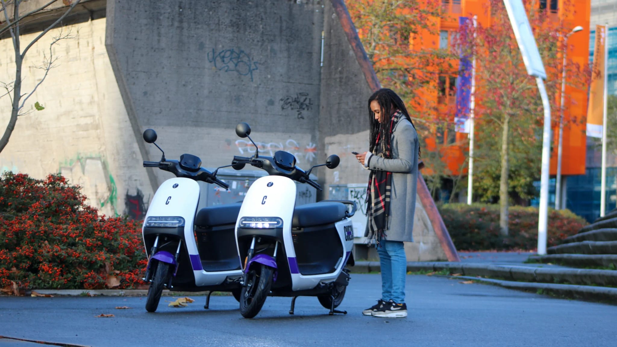
With Check’s app, scooters and helmets as the three essential touchpoints we designed for impact and experience. All captured in a simple but standout color palette, a bold but stylish typeface and a welcoming but energetic tone of voice. Standing out of the competitive crowd? Check. Outgrowing the competition? Check.